The Impossible Challenge of the BT Free logo
👁 46
https://mastodon.social/ : 👁 3
https://blenderdumbass.org/ : 👁 7
https://blenderdumbass.org/articles : 👁 4
https://blenderdumbass.org/search?text=BT+free&title=on&author=on&post=on&description=on&comments=on&tags=on : 👁 1
https://duckduckgo.com/ : 👁 1
![[avatar]](/pictures/favicon.png) by Blender Dumbass
by Blender Dumbass
Aka: J.Y. Amihud. A Jewish by blood, multifaceted artist with experience in film-making, visual effects, programming, game development, music and more. A philosopher at heart. An activist for freedom and privacy. Anti-Paternalist. A user of Libre Software. Speaking at least 3 human languages. The writer and director of the 2023 film "Moria's Race" and the lead developer of it's game sequel "Dani's Race".
Information or opinions might not be up to date.
After my participation in the Fireside Fedi show, which was a blast ( yet I believe it should have been longer, because we didn't even reach half of what I thought we would talk about ), being excited to see where the VODs of the show would be published, I went to the website and to the PeerTube channel of the show and realized that I don't like what I see. ↩ Reply
Chapter 1: The redesign of the Fireside Fedi
The Fireside Fedi PeerTube channel had what looked like pretty much the same thumbnail on every video. The layout of the video itself was garbage, you can see what I mean by clicking on the link I linked above. It had a logo of the fediverse in the center And two rather small circles on each side, which were the face-cams of both speakers. That was not good. ↩ Reply
I decided to message @Ozoned ( the show runner of the Fireside Fedi ) privately about my suspicions that the presentation of the show wasn't particularly amazing. And he agreed with me. But simply informing him of the matter didn't make feel like I did enough. ↩ Reply
I grow highly suspicious of people lately. It seems like nobody wants to do anything at all. And people want to be as lazy as they can be at every moment of their existence. AI, being so overwhelmingly popular, definitely doesn't help. I don't think @Ozoned is that type of lazy. He does a lot of very good work and barely has time for anything. But I barely knew him at the time. So I immediately assumed that whatever I just said to @Ozoned will never actually change anything. ↩ Reply
Don't get me wrong, having terrible frame composition on your show is not a crime. Making something be less optimal because this is the best you can do isn't anything particularly worth being angry about. So I wasn't angry about it. I just kind of wanted to help in a way. ↩ Reply
And then the fact that the show was badly presented, so to speak, made me anxious, because at its core Fireside Fedi is Free Software Activism. A thing that is very important in a world we live in today. So having it being badly presented might result in fewer people paying attention to the cause. Which is worse for everybody. ↩ Reply
I decided I will do it myself. I will design something myself, the way I edited the videos and thumbnails on Libre Planet 2024. And the way I yelled at FSF ( Free Software Foundation ) not FsF ( Fireside Fedi ) to merge all of their multitudes of PeerTube channels into one, so that they could be more effective at their Free Software Activism. ( Which required me to write two python scripts for them to move all videos into one channel, because with the speed at which they were moving nothing would have changed ). Anyway... ↩ Reply
I designed the new look for the Fireside Fedi. If you go into the same PeerTube channel now, you will see that the thumbnails are all unique, yet recognizable as belonging to the same show, featuring the faces of the guests in the videos. I made a GIMP file for @Ozoned , and taught him a few tricks in GIMP so he could make those thumbnails himself and it seems like my thumbnails are pretty much indistinguishable from his. ↩ Reply
If you look at, say the Interview with Cory Doctorow that @Ozoned did some time after he was done with me, you can see a new intro, with a Blender's fire simulation logo ( not some crappy looking drawing that barely gave any sense of rebellion ). The Fireside Fedi show turned from something silly and strange, to something, while still a bit amateurish, something that is a lot more Punk-Rock. A lot more rebellious. And a lot more eye catching. In my opinion. ↩ Reply
This I hope would now make more people see it, notice it and follow it. So that @Ozoned could do his part of Free Software Activism better through it. ↩ Reply
Chapter 2: The Impossible Logo of BTFree
BTFree is @Ozoned 's other mean of doing Free Software Activism. It is a non-profit organization that allows @Ozoned to do things like Fireside Fedi. But it is also a thing in and of itself. It's a project to help people move from proprietary platforms like YouTube and alike, to Libre platforms like PeerTube and alike. ↩ Reply
After I finished making the stuff @Ozoned used in Fireside Fedi, I guess I made him a little inspired, so he asked me if I can think of a logo for his BTFree project. ↩ Reply
Damn! ↩ Reply
This thing is so complicated, I don't know what to do about it. ↩ Reply
BTFree stands for Big Tech Free. Basically an idea of liberation from Big Tech. The idea @Ozoned was going for, is to turn the T in BTFree into a sword of some kind. A reference to The Three Musketeers, by Alexandre Dumas. A kind of reference to community. A reference to the fediverse. ↩ Reply
While it isn't particularly a terrible idea, at first I was simply concerned about the practical application of this kind of logo idea. Where would this logo be used and how? What would be the appropriate color-scheme? Would it be like on this website, like the logo on the home page? In which case, do I need the aspect ratio of the logo to be 1 to 1? And if the logo is square, how would "BT Free" be written down to make it work? ↩ Reply
Talking to @Ozoned we came up with a few ideas that might be interesting to pursue. For example the B could be drawn as a Bee. A nasty, kind of, insect character. Then if you add to it an English Top Hat and a cup of T. Well you get yourself an Oligarch. A nasty Oligarch. Representing the Big Tech ( BT ). But how do you want to get Free from it? ↩ Reply
Freedom is drawn usually as a bird. Either as an Eagle ( as in USA or Russia ) or as a dove, or pigeon. Should the message be then pigeon flies away from the nasty Bee to freedom? Or is that an indication of cowardice? And if so, should the logo be a bird eating, or killing the nasty bee? In which case its violent and kind of unpleasant for a logo. Don't get me wrong, for specific crowd, violence on the logo is perfect. But is it perfect here? ↩ Reply
Then there is the inherent conflict in the name itself. It's not like with Free Software Foundation, where the advocacy is for Free Software. With BT Free, the advocacy is primarily against something. It's against the Big Tech. Not for Free Software or for the Fediverse, but against Big Tech. There is this negativity, this conflict in the name already and the logo should somehow show it without being violent. ↩ Reply
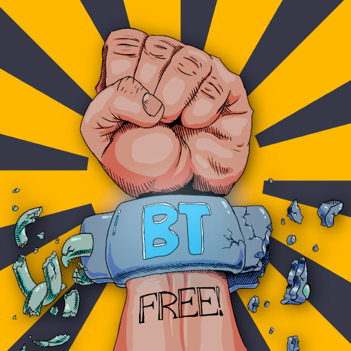
Maybe smashing something could be an idea? Not killing a Bee, but smashing a Big Tech device. A device that takes the freedom away. This was the inspiration behind this picture: ↩ Reply
![[embedded image]](https://files.mastodon.online/media_attachments/files/114/596/164/811/018/051/original/0670285a02c62615.png "Fist with word FREE is breaking through the Big Tech shackle.")
I looked up US slavery shackle designs and drew a version of that shackle being done from modern shiny material, something Big Tech products are usually made of, and with a neon BT sign written all over it. As you can see the hand that is shackled with this shackle is in the middle of breaking it, smashing both the shackle and the chain attached to it. The Fist in the air represents rebellion. The "FREE" tattoo on the arm is there to finish the sentence and make the whole thing read as "BT FREE". ↩ Reply
In a way it was a very good concept. It is kind of striking and communicates this rebellion very well. But it has a few issues. ↩ Reply
I was watching a stream by Lorenzo Ceccotti, an Italian comic book artist. And I asked him to look at the image. He found out a few issues with it: ↩ Reply
First of all there is a shading error in the palm of the hand. At the pillow under the thumb, that should be darker than the finger. But beside that, there are much more complicated issues. ↩ Reply
The image works only when it is big. If @Ozoned prints it on posters or T-shirts, it would work, because there is a lot of real-estate to actually see the details and understand what is going on. But using it as just a logo, or even worse as a website favicon, everything would just be so small, that maybe you could read the fist, but not much else. Also the composition is inherently vertical, as in the fist is a big thing above the text, which is not ideal. ↩ Reply
Then thematically, Lorenzo, also pointed out that in order to make the BT read smoothly into FREE on the hand, I have to have the shackle still be on the hand. Which is not a communication of victory over the oppression, but a struggle against oppression. It's way more depressing that way. ↩ Reply
![[embedded image]](https://files.mastodon.online/media_attachments/files/114/613/996/657/438/965/original/4a072be7089da4e6.png "First with FREE tattoo is punching through Big Tech gadgets that look like B and T.")
This led me into making this other idea. Here as you can see the BT Free is still read like it has to be. But the aspect ratio is square, making it useful in more contexts. I even drew a concept of the same logo simplified, for icons and stuff. ↩ Reply
![[embedded image]](https://files.mastodon.online/media_attachments/files/114/619/726/738/220/545/original/f90aa01bf1bc327c.png "Same image but 2D and simple.")
I've shown this to Lorenzo as well, and this time he made me realize that this is not reading as strongly as the previous one. There is no shackle here. It's just a fist smashing some devices. As far as he is concerned it could be a logo against technology as a whole. And because there is no chain it doesn't show liberation. It's just silly looking violence against the devices. ↩ Reply
I thought about the chain thing he told me about. That chains are a symbol of oppression. And are a symbol of slavery. So maybe chain-cutter could be a symbol of liberation. A symbol of a tool that cuts those chains. I drafted a silly little logo with it. ↩ Reply
![[embedded image]](https://files.mastodon.online/media_attachments/files/114/614/391/790/429/722/original/7dbc8471bbd7d1c8.png "Fist holding chain-cutter with words BTFREE")
I didn't go too far with it. But maybe something like this could be used for like a BTFree stamp or whatever. Like the stamp S.S.Rajamouli ( not a director of Space Balls ) uses in his films. You know the epic circle thingie that he likes to put on a freeze frame. ↩ Reply
Then I came back to thinking about the favicon problem. Those little bastards could be as small as 3 by 3 pixels sometimes. I know it is a stretch to try to design a logo that would work in such conditions, but I tried giving it a go. I came up with this shit: ↩ Reply
![[embedded image]](https://files.mastodon.online/media_attachments/files/114/619/763/974/391/706/original/b6c131c539bad907.png "A very basic square logo where T is actually Big.")
Here T is actually big as you can see. And this image is drawn on a 3 by 3 grid, so in theory it could be recognizable at very low resolutions. Which could be very good for a logo. But I don't know about it. Out of all the logos I tried, this looks like the most sterile and ugly of all of them. ↩ Reply
Chapter 3: Challenge for You!
I guess based on the BTFree account on Fediverse @Ozoned went with the first fist I did. And as you can see ( at least while I'm writing this article ) he also uses the Tree Musketeers idea that he personally came up with in a different place. ↩ Reply
But then @Ozoned opened a BTFree Matrix space and in there he made 2 chat-rooms. One using the first fist design I drew. And the other without an icon for now. The room is called "Tube Free" and is I think about the PeerTube instance that will be hosted by BTFree as a part of the mission of moving people away from YouTube. ↩ Reply
He asked the community to try to design the logo... So... I guess... ↩ Reply
Happy Hacking!!! ↩ Reply
Find this post on Mastodon
![[thumbnail]](/pictures/thumbs/where_you_draw_line.jpg)
![[thumbnail]](/pictures/thumbs/hope.jpg)
![[thumbnail]](/pictures/thumbs/talmudic_free_software.jpg)
![[thumbnail]](/pictures/thumbs/money_stats.png)
![[thumbnail]](/pictures/thumbs/equal_rights_to_kids.png)